Go Back
VendTel - B2B Vending machine for tools and safety gear within the manufacturing industry
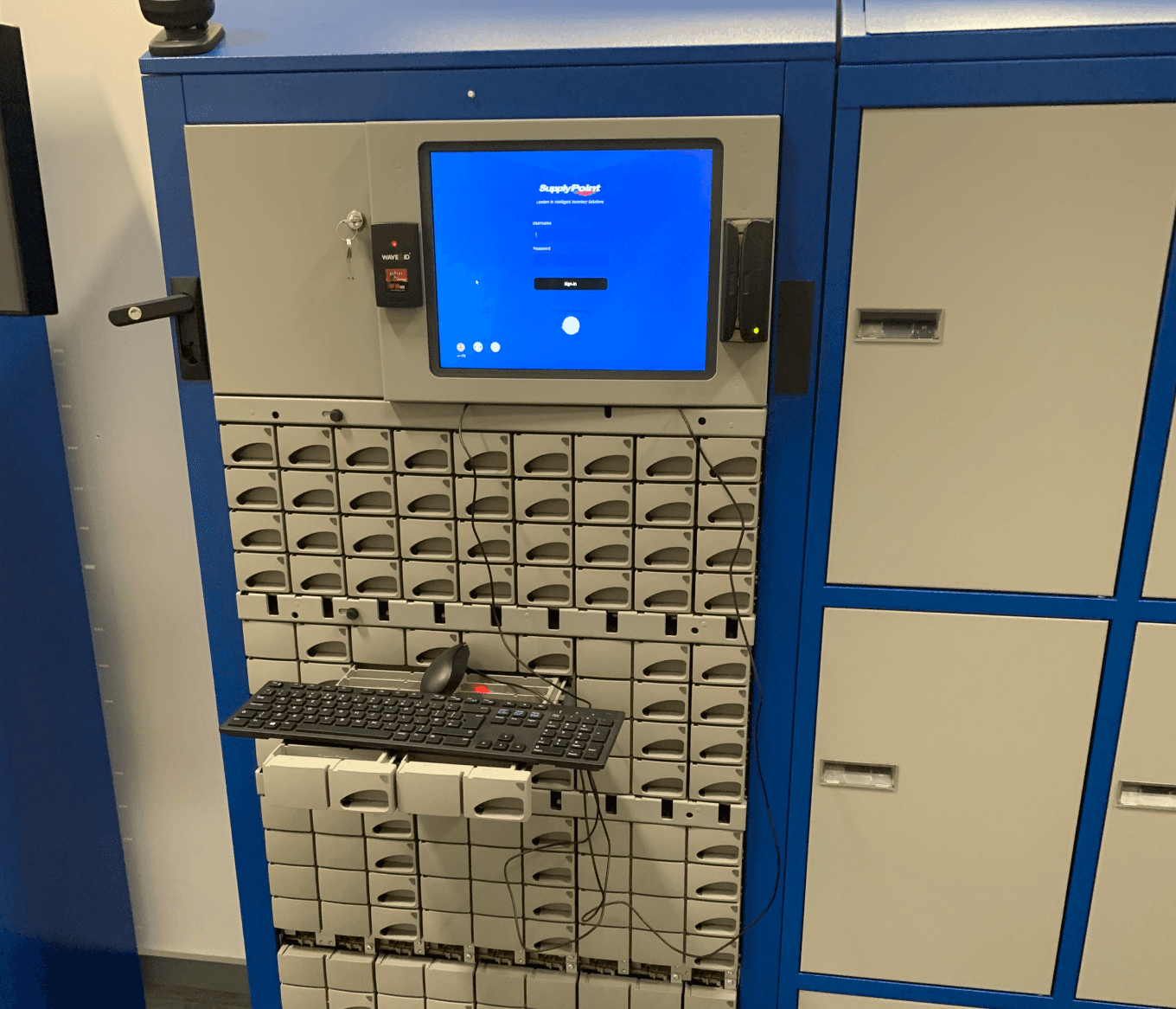
A unique POS serving global clients using a patented vending system for all sorts of applications, the same system that services like Amazon uses for their delivery lockers. My role was to overhaul the system and improve the time it took to withdraw items.
VendTel
Business Goals:
Update the user interface to align with a major technology update using React JS
Improve efficiency for core end users
Align corporate brand with the UI
Create a design system that can be used in future versions
User wants:
Quickly find the parts and tools they require for their role
Spend the least time possible searching
Have a system that suits their role and is custom to their needs
User needs:
Retrieve tools and parts
Locate compartments
Securely log in using multiple methods
Manage inventory for projects
Manage new users
Assign user roles
Edit company wide settings and apply custom branding
Group inventory for staff members
Generate stock level reports
Engineer Focused
Although there was multiple user types for example admin, restock and management the focus was on the user in front of the machine as the unique part of this design was to be intuitive enough not to require retraining.
Summarised user overview:
Admin - Manages stock, staff and general company based settings
Restock - Manages stock replenishment and tracking which is sometimes per project
Engineer - On the tools daily, requiring stock to complete their tasks

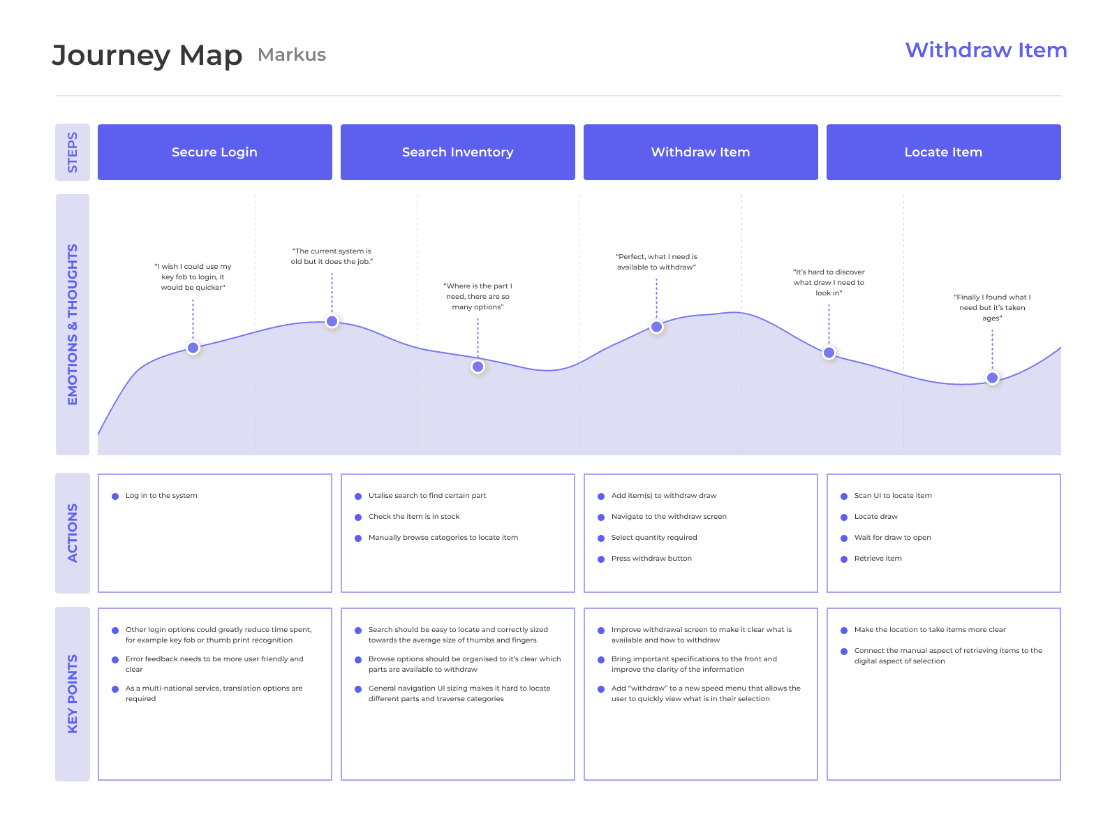
Markus Koppenhoefer
Occupation
Engineer within a well known car manufacturing plant in Germany, working on final finishing
Demographics
47 years old
Goals and Needs
With a demanding job that requires precision and accuracy Markus is a exceptionally well trained individual. Time spent interacting with inventory is kept to a minimum. However Vendtel's current system is important to most tasks that Markus completes for his role. He strives to finish components to the greatest accuracy whilst keeping to deadlines.
Pain Points
Markus has difficulty navigating the current system due to over complexity and out dated design patterns. Whilst the current offering does the job it could be a better aid to his day to day role and therefore increase efficiency in measurable units like time spent retrieving tools and inventory.
Personality
“I love precision tools that get the job done but I am kind of a technophobe when it comes to digital technology.”
Engineer Journey Mapping:
VendTel
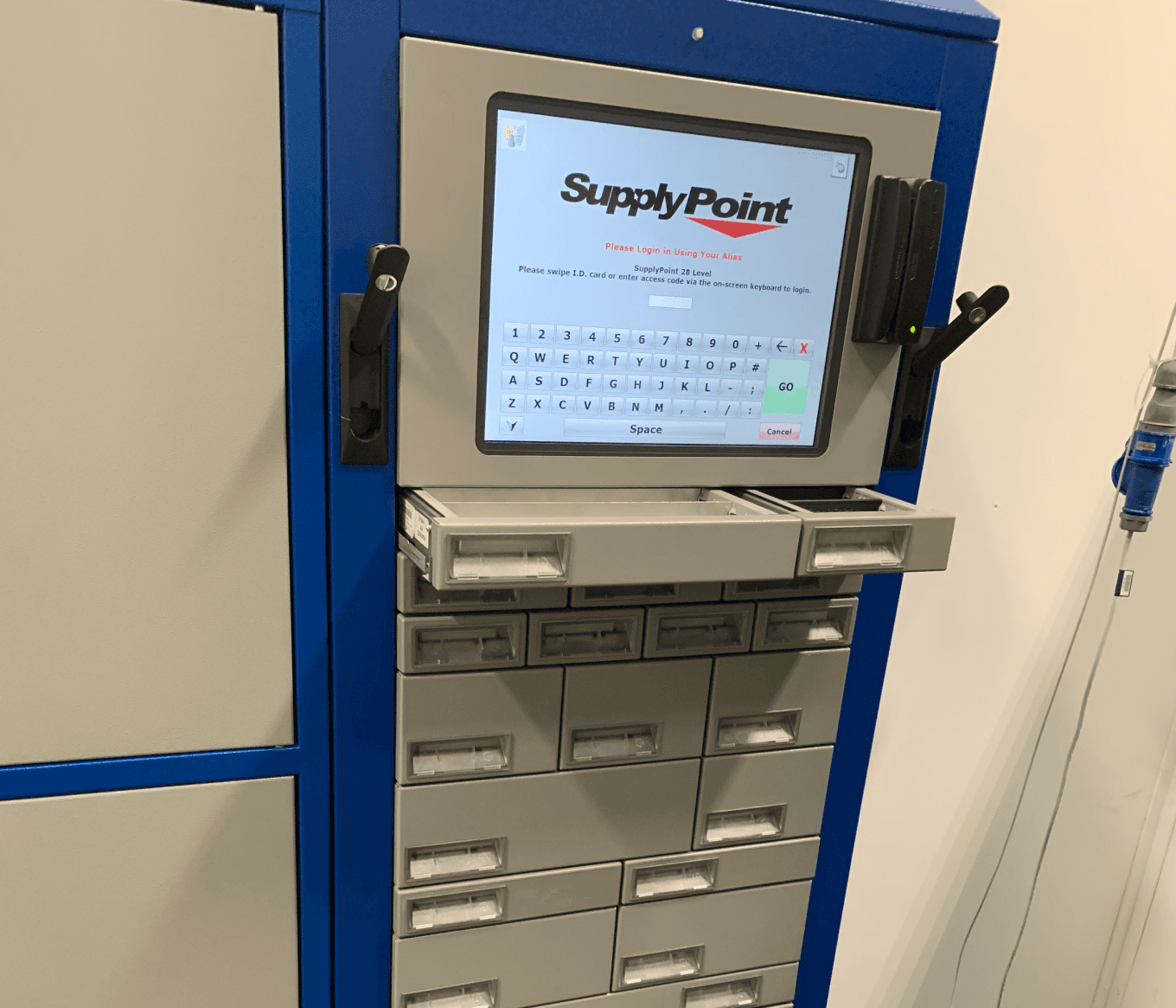
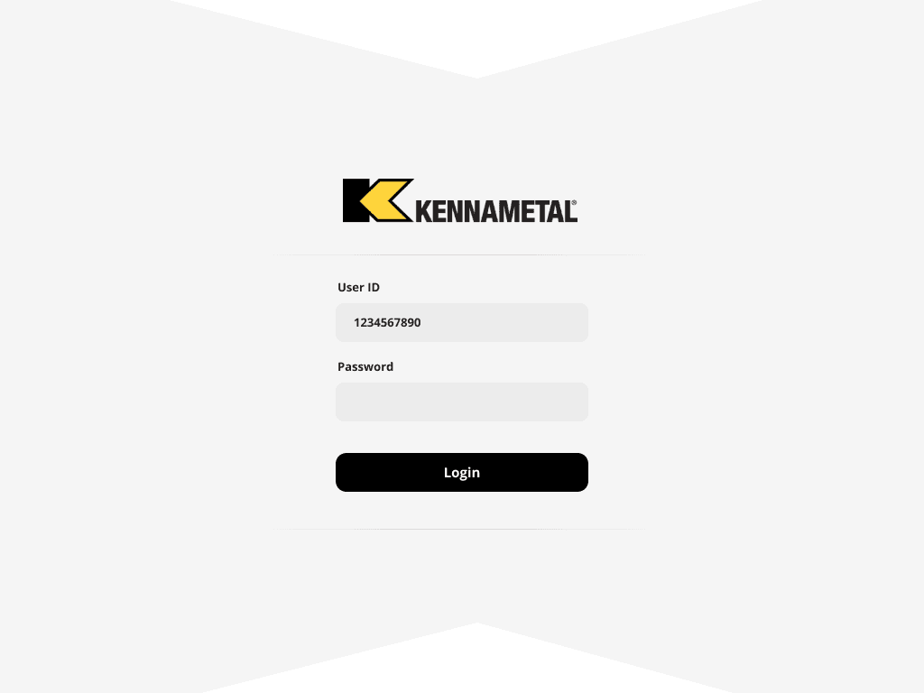
Original Display in-action
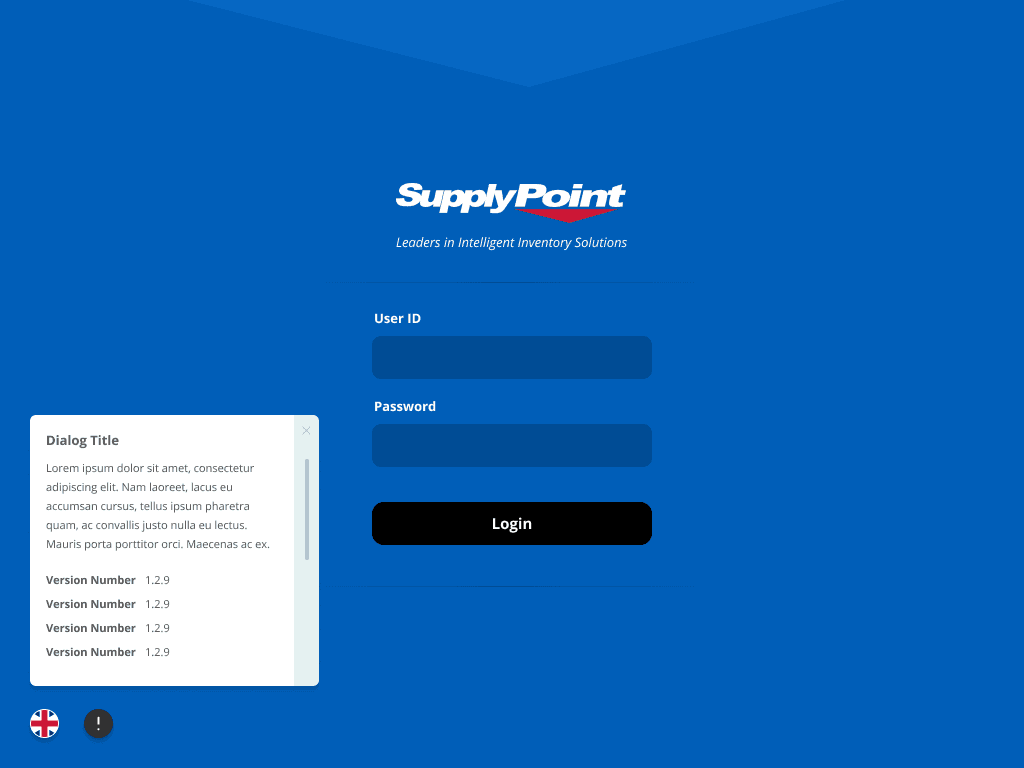
The below is the original login screen, as you can see it was out of date and used colours in a way not complimenting the overall experience. The original screens were supplied as the "wireframes" however I personally fought for significant UX improvements along the way. Very "Windows 98" if you are old enough to remember. I am 1991 but the IT guy in my secondary school refused to upgrade to XP for years spouting security concerns, so 98's iconic style is burned into memory.
Menu Upgrade
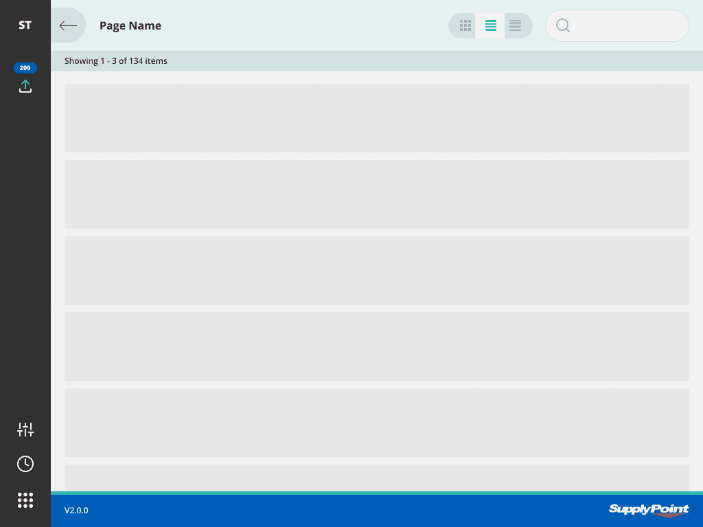
One element that I had to fight for a redesign was the "flexible" menu system that could be tailored to towards the end user based on their role. It was unclear to me how this approach could save users time in the end, with uneven sizing, unorganised options, no iconography and still with important options hiding behind a dropdown menu I began to pitch a new UX pattern from the likes of Discord and Slack.
The theory behind the change was that realistically to 90% of the users it needed to be 5 options maximum and in reality the screens were landscape meaning there was always a dead space to the right of left which was under used. Creating a quick menu to the left hand side allowed a 2 handed navigation style also improving ease-of-use.
Old Menu

New Menu
Reducing steps, increasing navigation speed, with key options still remaining like items in the withdraw section. This style was very well received when rolled out across the global user base.

Custom Branding
One thing the technological upgrade enabled was custom branding. The React JS backing enabled different themes to be implemented for clients. Every colour and shading choice was tested across the suite to comply with the requirements of this feature
Example
VendTel

Use of icons to display function
Part of the redesign included conceptual work on iconography for Vendtel. Using icons to convey functionality was in many cases necessary for complex options.

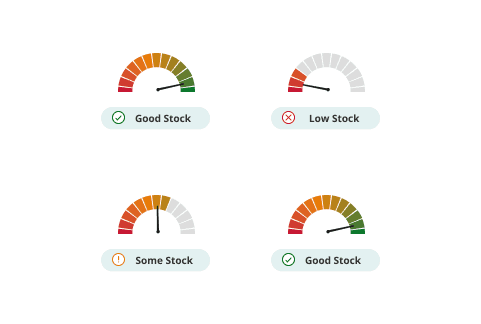
Visual Indicators
Due to the nature of the user throughout the project we came up with innovative ways to display status visually so that everyone could understand function without excessive documentation and explanation. This way allowed stock levels to be seen in an instance by the user.
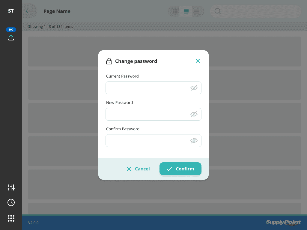
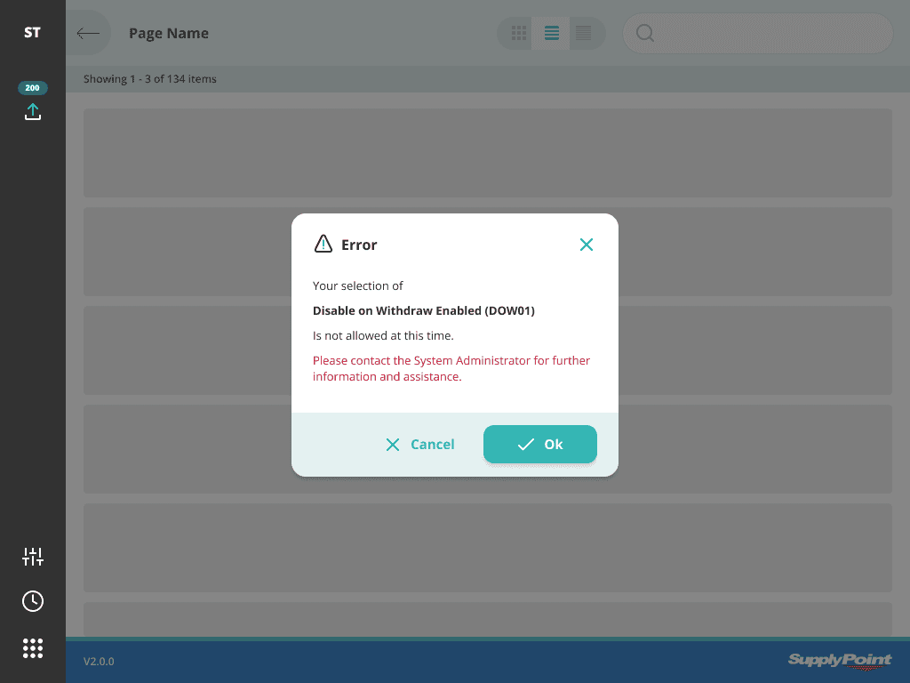
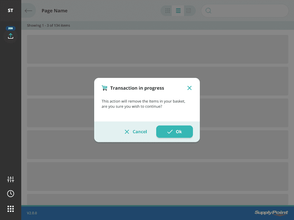
Dialogs
Dialogs were designed to be used by hand not mouse so UI elements were sized correctly. To reduce fatigue and follow the diagram above for navigation options like accept and cancel were positioned close together to save excessive movement.
VendTel

Reflection
A successful global roll out to 100,000 daily users without the need to re-train users on it's use. Considering the aggression of the redesign this was a very successful metric for me and the team involved in the project. In fact it was such a success we even got recommended to work with the larger sister company in the US on an interface for operating theatres.